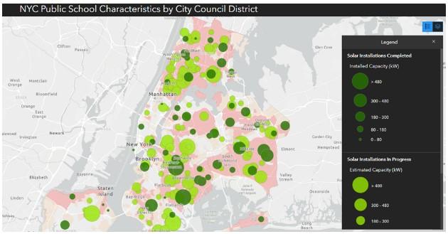
NYC DOE Public School Dashboard shows climate and childhood health inequities across the five boroughs
The Labor Leading on Climate team has just released an interactive dashboard that allows users to explore public school characteristics across City Council Districts in New York City. Users can investigate climate, health, equity/inequity, and building trends across the five boroughs. This dashboard was designed and built by Research and Policy Associate and Queens resident Anita Raman, with research assistance from graduate student Jasmin Higo.
Using the dashboard requires just four easy steps.
Step 1. Select a City Council District
The first step is to click on a District of interest on the top left of the dashboard screen. The map will zoom into this district. All the data on the right of the screen will change to reflect statistics in that district. Use the roller on your mouse to zoom in and out of the map, or click the + and - boxes in the lower right corner of the map.
Step 2. Select a NYC Public School
To learn more about an individual public school click on the school in the lower left corner after selecting the district. A box will pop up with characteristics of that school including year, site energy use intensity, site energy use, total emissions, total emissions intensity, neighborhood name, and asthma rates in that neighborhood.
Step 3. Choose Map Layers
On the map, there is an icon with three stacked squares. This is the layer option. To turn a layer on or off, click on the eye next to the name of that layer. At present there are seven layers to choose from:
- Annual Air Pollution-Attributable Asthma Emergency Department Visits and Hospitalizations per 100,000 children. This is the default layer. Every public school is represented as a filled dot in this layer. The color of the dot represents the frequency of childhood hospital visits per area. Light yellow reflects low hospital visits through dark blue reflects high hospital visits.
There are distinct differences in health outcomes between NYC children even within a small area. This is a snapshot of areas around Prospect Park, where Bedford Stuyvesant-Crown Heights (top right) has 332 annual childhood hospital visits per 100,000 children compared to Downtown-Heights-Park Slope (top left), which only has 121 annual childhood hospital visits.

- Environmental Justice Areas (EJA). NYC defines an EJA as “a low-income community located in the city, or a minority community located in the city.” This can be layered with the Asthma ED and Hospitalizations layer and shows EJAs with high or low asthma hospitalizations. It can also be layered with solar installations completed or in progress to show presence or absence of solar investment in EJA areas.
- Opportunity Zones (OZs) – According to HUD, “Opportunity Zones are economically distressed communities, defined by individual census tract, nominated by America’s governors, and certified by the U.S. Secretary of the Treasury. New investments in Opportunity Zones may be eligible for preferential tax treatment. Many have experienced a lack of investment for decades.” This can be layered with the Asthma ED and Hospitalizations layer and shows OZs with high or low asthma hospitalizations. It can also be layered with solar installations completed or in progress to show presence or absence of solar investment in OZs.
- Age of Schools. This is a heat map layer and shows clusters of areas with the oldest schools. “High” corresponds to the highest age or oldest schools. “Low” corresponds to the lowest age or newest schools. Of all five boroughs, Staten Island has the newest and most spread-out schools. Add the Asthma layer to see relationships between asthma rates and age of schools.

- Solar Installations Completed – This layer shows all solar installations completed on school roofs and the size of installation by KW. This is best viewed with EJ or Opportunity Zones and Solar Installation in Progress.
- Solar Installations in Progress – This layer shows all solar installations in progress on school roofs and size of planned installation by KW. This is best viewed with EJ or Opportunity Zones and Solar Installations Completed.
At present there are many more projects in progress than are currently installed. Many are concentrated in EJ zones. Installations in progress are trending larger than installations currently installed.

- NYC City Council Districts – This layer shows the outline of each city council district and will flash when you select a district on the top left of the screen.
Step 4. Repeat Steps 1-3
If you find the dashboard to be useful, or have other comments or feedback, please reach out and tell us! Stay tuned for additional layers that will be added in the future!
