How Job Losses During the COVID-19 Recession Compare to Past Recessions
Recovering Payroll Jobs: August 2020 Update
How does the jobs impact of the COVID-19 recession compare to previous downturns so far? This post shows some of the unique features of this recession. It also highlights that while we have already recovered about half the jobs lost, returning to the level of jobs we had in February will likely take many years.
Economists often track recessions by comparing their impact on key indicators to previous downturns’ patterns. The indicator used most commonly is the number of jobs on company payrolls, produced by the Bureau of Labor Statistics’ Current Employment Statistics program. This measure has many important virtues.1 It’s a simple concept that hews close to most people’s concerns about recessions. BLS has measured it essentially the same way since the 1940s. Payroll jobs correlate well with other measures of the business cycle, such as gross domestic product. And, jobs can be measured well across all parts of the economy.
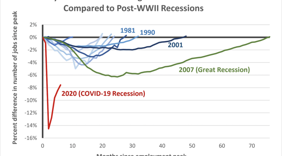
Each recession has a different depth, speed of job loss and speed of job recovery. To see this, the attached chart lines up all the post-war recessions. For each recession, we begin with the month before payroll job losses began; we call that the “peak month.” Then we can track the percentage of jobs lost during the downturn until the number of jobs returns to its pre-recession peak.
The chart labels the current recession and the previous three. First, we can focus on the declines in jobs after the peak. This identifies two features of the COVID-19 recession job losses:
-
Deepest ever. By April, about 15 percent of jobs were gone, compared the previous maximum of six percent during the Great Recession.
-
Most abrupt. Previous recessions built up over time. Job losses continued for at least five months for previous recessions, while (if we are lucky) this recession reached its deepest point after just two months of losses.
Turning to the recovery of jobs, note that in almost all previous cycles, it has taken more time to regain lost jobs than to lose them. Indeed, the most recent downturns (1990, 2001 and 2007) were termed “jobless recoveries” because they had very slow job growth after the losses stopped. The April to August jobs recovery during the COVID recession has three key features:
-
Fastest job regaining pace ever. So far, we’ve added a higher percentage of jobs per month than in previous recessions. This is no doubt due to pervasive temporary layoffs and recalls stemming from virus-related shutdowns.
-
Hole is still deep. Although half of lost jobs are back, we are still down almost eight percent of payroll jobs. Although this means that almost half of the jobs lost have been recovered, we still have more losses than the six percent losses at the jobs low point of the Great Recession.
-
Pace now slowing noticeably. The strong early pace of COVID-19 jobs recovery weakened noticeably in July and August.
Going forward, what will the recovery look like? The paths of previous recoveries help frame the question. Will we have another jobless recovery, like that of the Great Recession? If so, that means six years before we return to the number of jobs we had in February. It is very much too early to tell. After the job losses of Great Recession, we had no pandemic. That could mean an even longer recovery. On the other hand, many economists agree that our fiscal stimulus (mostly in the form of the American Relief and Recovery Act) was too modest compared to the severity of the economic shock. Thus, there is room for fiscal policy to take a stronger hand this time to help speed the recovery—by supporting consumption, investment and provision of services to disadvantaged populations. If we take those actions, we would likely achieve a faster recovery than we did during the most recent recessions.
Bottom line: The prospects for a speedy jobs recovery is most likely to depend on two key factors--the path of the pandemic and robustness of fiscal stimulus for the economy.

Source: U.S. Bureau of Labor Statistics Current Employment Statistics program and author’s calculations.
1 Note: No method can answer all questions, so it is also important to understand the limitations of this approach. First, the number of jobs on payrolls misses some important labor market complexities. For example, it doesn’t take factor in self-employed workers, or adjust for hours worked or earnings. Second, as we add up jobs all across the country, we do not consider that impacts will often differ substantially by geography or demographics. So, we are not looking at inequality of any sort. Third, by looking at the total number of jobs we take no account of dynamics or churning (that is, how much job creation and destruction underlies the smaller net change). Fourth, we are not looking directly at how much of the value created by these workers has been lost or restored. Fifth, we have not adjusted for the growth in jobs that would have occurred in the absence of the recession. Thus, the time to recovery shown here is underestimated by the extra time it would take to return to a long-term trend. This is particularly important for deep recessions with slow recoveries, as is likely in this case.


